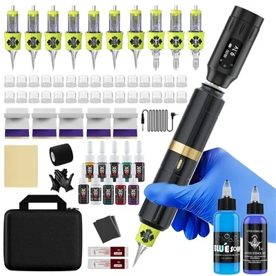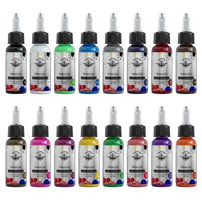
With the development of material technology, the variety and safety of tattoo pigments are improving, and color-based tattoo styles have emerged. Color is different from black and gray. In addition to brightness, there are many factors that need to be considered. , Here is a brief share of basic art color knowledge with you.
Light and color, modern art theory believes that everything we see is formed by the reflection of light. Red objects reflect red light, yellow objects reflect yellow light, and green objects reflect simultaneously in a certain proportion. Yellow and blue light, so the impressionist artists think that everything we see is made up of light, so their paintings abandon the specific shape, only use various colors to build the "look" of the object, to achieve the ultimate The one is Seurat of Pointillism.
The three primary colors. Since the colors come from light, the three most basic colors in light are true red, true yellow, and true blue. These three primary colors are called the primary colors. The reason they are called primary colors is because these three colors How can it be obtained through the method of color harmony, that is, it has never been possible to use a green and purple to make a red. These three colors are natural.
These three colors, when matched in pairs, will produce three new colors, red + yellow = orange, yellow + blue = green, blue + red + purple, and the six colors can be summoned.
The name of Shenlong is called "color wheel". On the color wheel, the color at any position and the color directly opposite to it is called "complementary color". "Complementary" is to complement the three primary colors of "red, yellow and blue", such as red. The complementary color is green, green is composed of yellow and blue, and the three primary colors of red, yellow and blue are all together.
The two colors crossed by the white line are complementary colors
The use of complementary colors is to harmonize the overall picture, and at the same time it can play a contrasting effect. For example, to make a red peony. From the perspective of classic art, only red will look burnt. If you embellish the leaves with a little green, The overall effect of the picture will be more harmonious.
But in actual use, the complementary colors cannot be reconciled or directly gradient each other. If two complementary colors (including all the components of the red, yellow and blue ternary colors) are mixed together, the color will become very dirty gray, so we This kind of abrupt gradation must be avoided when drawing.
Three leaves, the first one directly transitions from red to green (over-complementary color), the color at the junction will become dirty, even with a relatively powerful means of correction such as computer drawing, the color at the junction will be blurred. If red and green must appear on a leaf at the same time, there are two more reasonable ways to deal with it. One is the Old School, old traditional design idea similar to Figure 2, where the border is separated by white space, and the two colors are not Intersect; the other is like Figure 3, which often appears in New School or new traditional designs. Using a middle color to connect can also be established, and it will make the colors richer.
The space is limited. Today, I will briefly explain the most basic foundation of color, and I will slowly advance later.